Forum Announcement, Click Here to Read More From EA_Cade.
Minor Homescreen UI Adjustments I'd Love (with mock-ups)
 Wilderwolf
Posts: 3,406 Member
Wilderwolf
Posts: 3,406 Member
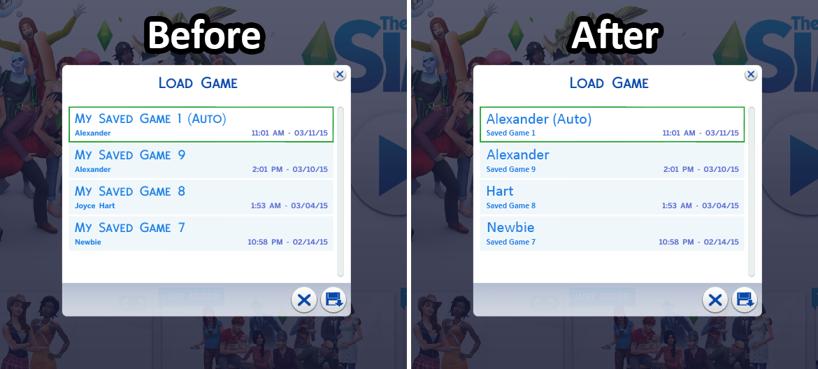
These are just some mock-ups I made in Photoshop to help express my desired look.
1. The home screen should definitely state which family will be loaded when you click the play button without having to check the floppy disc button first. The usual save file information could simply be listed below the button as shown.
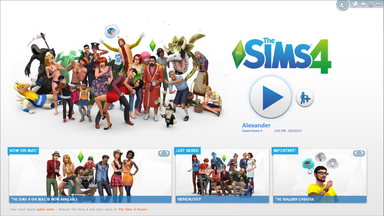
2. The save files listed on the floppy disc button should state the family name first and then which number it is. The family name is much more important than the save file number, so it should definitely be listed first in the bigger font. Not only does it make things easier to find, but it looks more aesthetically pleasing because you don’t have “MY SAVE GAME #” screamed at you repeatedly. That brings me to my last point of removing the all caps as they’re unnecessary.
What do you guys think?
1. The home screen should definitely state which family will be loaded when you click the play button without having to check the floppy disc button first. The usual save file information could simply be listed below the button as shown.
2. The save files listed on the floppy disc button should state the family name first and then which number it is. The family name is much more important than the save file number, so it should definitely be listed first in the bigger font. Not only does it make things easier to find, but it looks more aesthetically pleasing because you don’t have “MY SAVE GAME #” screamed at you repeatedly. That brings me to my last point of removing the all caps as they’re unnecessary.
What do you guys think?
3
Comments
Also, I'd like to see that upper right-hand corner much bigger. A lot of players don't discover it for a while, or until they're told it's there. The play button and + sign are so big that we see players who don't realize they can start a new game fresh or find an old one to load.
I've been playing since the day it came out and never once clicked the save as button and realized you could name the file yourself. So thank you very much for that info. I guess ignore that UI adjustment then.
Yes. At the moment, what you see in the save file list does include the name of the household you're currently playing, though. In my list, that's often the same household a few separate times; I need the savegame name + the save date and time to help me differentiate clearly.
Named saves are still a thing! When you do "Save As", just click in the name box and change it. I was just suggesting that the save name might be more visually important than it is in the rearranged UI than the original photoshop image suggests. It's a thing, though