The latest update for The Sims 4 is now live. Click here to read the latest notes.
Forum Announcement, Click Here to Read More From EA_Cade.
New UI Picture
 Sk8rblaze
Posts: 7,570 Member
Sk8rblaze
Posts: 7,570 Member
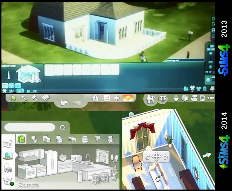
Credits to BubblesO on modthesims.info for this comparison screenshot.


As you can see, the UI no longer has that blue scheme that ALL of the other Sims games (1, 2, and 3) had. It's replaced by this white, simple, and translucent UI which IMO looks MUCH better (and more modern being this is the trend as of now with UI).
Also, we FINALLY have the ability to search by keyword when looking for furniture!!
0
Comments
Yeah, it looks much cleaner, organized, and simple compared to TS3 and really all of its predecessors. :-)
We'll definitely see more of the UI and building soon, when they release the building gameplay trailer!
:shock:
The comparison to sims 3 UI seems a bit odd, as the house they show is all blurry, mine never looked like that. :?
That's a picture from the Sims 4 when it was shown off last year at Gamescom.
Oh, that isn't TS3 - that's the earlier version of TS4's UI. It's blurry because it was taken by a fan at the GDC event in Germany with a camera pointed at a big display.
Oww thank you, guess that shows how vast the improvement has been in this area.
In which case nope no criticisms with the UI from me then
Yeah, the person who took the picture only took snippets of various parts. I updated the original post with a full picture.
I'm sure they'll keep the minimalist design, but I think it's quite likely they'll bring blue back into it, since that is a staple of The Sims franchise.
Origin ID: Tiki5872
This makes me happy dance
Better looking then this:
Do my eyes deceive me? There is a design tool there!? See...eye dropper, Thor's Hammer, Design Tool. Eek! Or just regular old recolor tool.
I thought that was just to access the color swatches for stuff. Kind of like that button (notepad wasn't it?) in the sims 2 that opened the other colors menu for items.
youtube.com/IronSeagull
Athletic->swimwear