Forum Announcement, Click Here to Read More From EA_Cade.
💚New Sims 4 Packs- Old style covers💚
 YBNS2468
Posts: 240 Member
YBNS2468
Posts: 240 Member
SP20: Crystal Creations
HQ Box Art, Logo & Icon


EP15: For Rent
HQ Box Art, Logo & Icon


HQ Full Box Art:

Print Ready File:
https://www.mediafire.com/file/gedwg6yrw9kqdrg/The_Sims_4_EP15_For_Rent_Full_Box_Art_Print.pdf/file
SP19: Home Chef Hustle
HQ Box Art, Logo & Icon


EP14: Horse Ranch
HQ Box Art, Logo & Icon


HQ Full Box Art:

Print Ready File:
https://www.mediafire.com/file/1qk3ysiyn903h65/The_Sims_4_EP14_Horse_Ranch_Full_Box_Art_Print.pdf/file
EP13: Growing Together
HQ Box Art, Logo & Icon


HQ Full Box Art:

Print Ready File:
https://www.mediafire.com/file/txqwxjz1ohna61y/The_Sims_4_EP13_Growing_Together_Full_Box_Art_Print.pdf/file
EP12: High School Years
HQ Box Art , Logo & Icon


HQ Full Box Art

Print Ready File:
https://www.mediafire.com/file/vf5gng22jvmbwri/The_Sims_4_EP12_High_School_Years_Full_Box_Art_Print.pdf/file
GP12: Werewolves
HQ Box Art , Logo & Icon

 i
i
GP11: My Wedding Stories
HQ Box Art , Logo & Icon


EP10: Cottage Living
HQ Box Art+Logo+ Icon


HQ Full Box Art:

Print Ready File:
https://www.mediafire.com/file/w8794vd7i39g08n/The_Sims_4_EP11_Cottage_Living_Full_Box_Art_Print.pdf/file
GP10: Dream Home Decorator
HQ Box Art+Logo+ Icon


SP18: Paranormal
HQ Box Art+Logo+ Icon


EP10: Snowy Escape
HQ Box Art+Logo+ Icon


HQ Full Box Art:

Print Ready File:
http://www.mediafire.com/file/xai2l7ta0yjt03z/The_Sims_4_EP10_Snowy_Escape_Full_Box_Art_Print.pdf/file
GP09: Star Wars: Journey to Batuu
Box Art , Logo & Icon


SP17: Nifty Knitting
HQ Box Art+Logo+ Icon


EP9: Eco Lifestyle
HQ Box Art+Logo+ Icon


HQ Full Box Art

Print Ready File:
https://www.mediafire.com/file/36yr3bq34vla84l/The_Sims_4_EP9_Eco_Lifestyle_Full_Box_Art_Print.pdf/file
SP16: Tiny Living Stuff
HQ Box Art , Logo & Icon


EP8: Discover University
HQ Full Box Art

Print File (PDF):
https://mediafire.com/file/jg3ag9q1w51c5rd/The_Sims_4_EP8_Discover_University_Full_Box_Art_Print.pdf/file
HQ Box Art+Logo+ Icon")


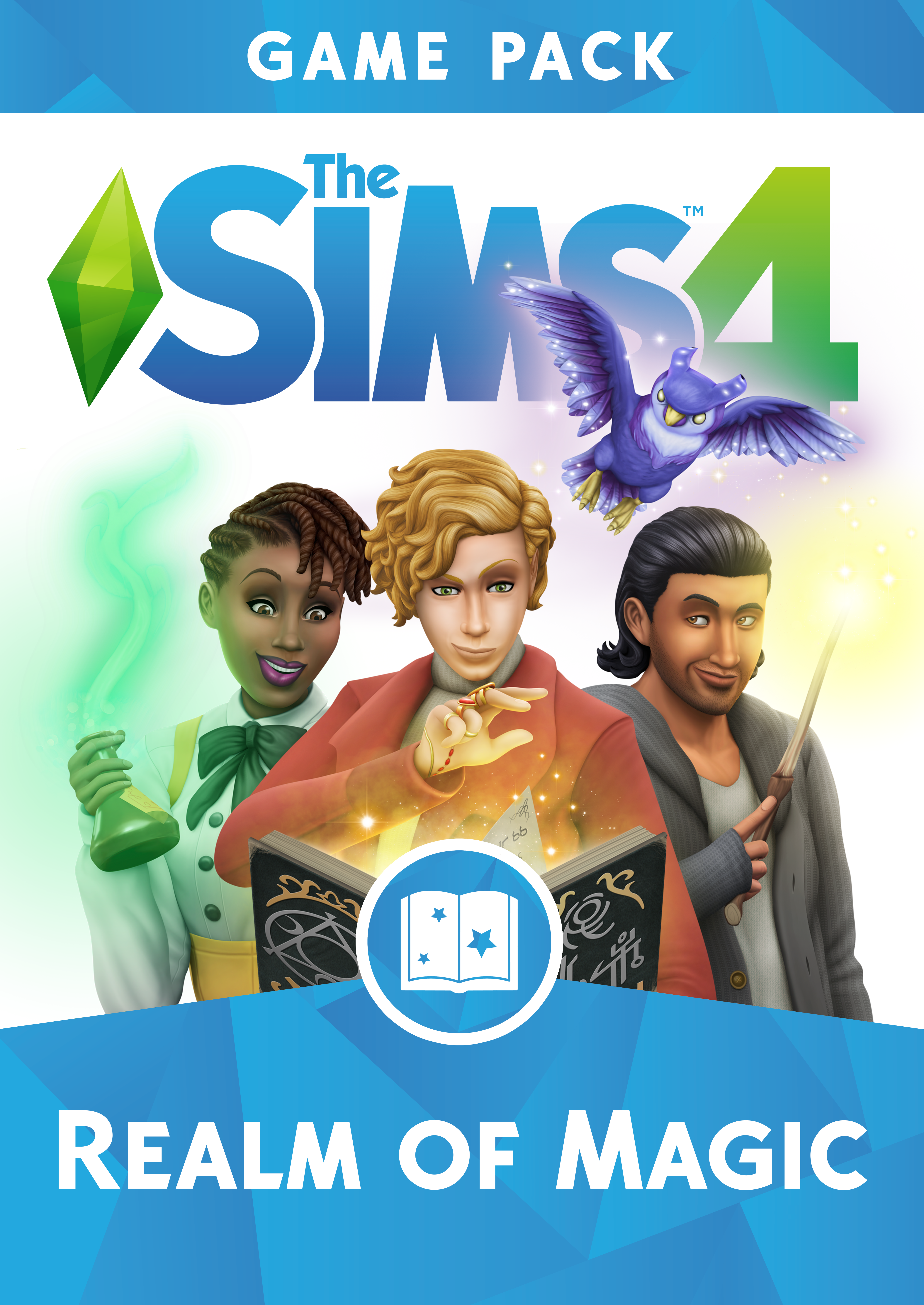
GP8: Realm of Magic
HQ Box Art , Logo & Icon

SP15: Moschino Stuff
HQ Box Art , Logo & Icon


HQ Box Art, Logo & Icon
EP15: For Rent
HQ Box Art, Logo & Icon
HQ Full Box Art:
Print Ready File:
https://www.mediafire.com/file/gedwg6yrw9kqdrg/The_Sims_4_EP15_For_Rent_Full_Box_Art_Print.pdf/file
SP19: Home Chef Hustle
HQ Box Art, Logo & Icon
EP14: Horse Ranch
HQ Box Art, Logo & Icon
HQ Full Box Art:
Print Ready File:
https://www.mediafire.com/file/1qk3ysiyn903h65/The_Sims_4_EP14_Horse_Ranch_Full_Box_Art_Print.pdf/file
EP13: Growing Together
HQ Box Art, Logo & Icon
HQ Full Box Art:
Print Ready File:
https://www.mediafire.com/file/txqwxjz1ohna61y/The_Sims_4_EP13_Growing_Together_Full_Box_Art_Print.pdf/file
EP12: High School Years
HQ Box Art , Logo & Icon
HQ Full Box Art
Print Ready File:
https://www.mediafire.com/file/vf5gng22jvmbwri/The_Sims_4_EP12_High_School_Years_Full_Box_Art_Print.pdf/file
GP12: Werewolves
HQ Box Art , Logo & Icon
GP11: My Wedding Stories
HQ Box Art , Logo & Icon
EP10: Cottage Living
HQ Box Art+Logo+ Icon
HQ Full Box Art:
Print Ready File:
https://www.mediafire.com/file/w8794vd7i39g08n/The_Sims_4_EP11_Cottage_Living_Full_Box_Art_Print.pdf/file
GP10: Dream Home Decorator
HQ Box Art+Logo+ Icon
SP18: Paranormal
HQ Box Art+Logo+ Icon
EP10: Snowy Escape
HQ Box Art+Logo+ Icon
HQ Full Box Art:
Print Ready File:
http://www.mediafire.com/file/xai2l7ta0yjt03z/The_Sims_4_EP10_Snowy_Escape_Full_Box_Art_Print.pdf/file
GP09: Star Wars: Journey to Batuu
Box Art , Logo & Icon
SP17: Nifty Knitting
HQ Box Art+Logo+ Icon
EP9: Eco Lifestyle
HQ Box Art+Logo+ Icon
HQ Full Box Art
Print Ready File:
https://www.mediafire.com/file/36yr3bq34vla84l/The_Sims_4_EP9_Eco_Lifestyle_Full_Box_Art_Print.pdf/file
SP16: Tiny Living Stuff
HQ Box Art , Logo & Icon
EP8: Discover University
HQ Full Box Art
Print File (PDF):
https://mediafire.com/file/jg3ag9q1w51c5rd/The_Sims_4_EP8_Discover_University_Full_Box_Art_Print.pdf/file
HQ Box Art+Logo+ Icon
GP8: Realm of Magic
HQ Box Art , Logo & Icon
SP15: Moschino Stuff
HQ Box Art , Logo & Icon
Post edited by YBNS2468 on
33
Comments
I knew it might be wrong but I wasn't sure.... (English is not my native language so I'm making mistakes like this very often
Here is a quick fix:
Thanks for commenting!
Exactly my thoughts...but as you said- they force us to eccept it. The new design is growing on me and and i'm getting used to it... But I still think it's a bad design. Especially the colores they chose. The old looked WAY much better...😳 but....whatever. It's too late to go back.
I think my huge problem with it is that in the end the rebrand seems useless! Why change a main menu when the entire game still use white UI? Why they tell me is more easy to separate Expansions from Game Packs when they literally made them all blue now?
And why the need of a new plumbob? And here is where I accepted better because I don't hate the plumbob and I don't think its his fault. But this plumbob will not "shine" like the others because the game itself still use the original one... and why on earth in the future when we will see something like The Sims evolutions or chronologies and from all the games The Sims 4 is the only that have two different plumbobs and one of them is basically nothing than an image? WHY????
If it was to rebrand I would rebrand literally everything! And I would never choosed that horrible saturated blues and greens but thats another topic...
Its the 4th time The Sims 4 changed its main menu in 5 years. It looks like they never found one solution for what they are trying to give us. The Sims 4 kinda looks like a game that never found its own identity.
I Wasn't a fan of the plain white when I first saw it... Now I think it looked very modern. I'm sure it will age better then the new one. They went from one extreme to the other. Now they chose those extremely bright colores LOL
They actually made it harder to tell the differences when you see those little icons in the catalog. But apparently they care more about the time we spend on origin then the time we spend when we PLAY the game.
- And physical boxes having 2 different styles...😫😫😫
😁😁😁😂😂😂
Also, they should bring back disk copies.
So much more appealing...I really don't know who did the ok for our packaging now..it looks SO ugly.
I have to agree... I can totally live with the way GP and SP will look from now on- I buy only digital copies. But my OCD will NEVER let me live in peace with the physical boxes I see in front of me when I look at my shelf...
HQ Box Art+Logo+ Icon
Race Against the Clock: Can your elder sim turn back the clock before their time runs out?
Don't worry... I won't!!
Beautiful. You are very talented.