Forum Announcement, Click Here to Read More From EA_Cade.

I Need Your Opinion--Which One Is Better?

Hi you guys; I need your help. I'm experimenting with a new blog, and I'm trying to make it more visually appealing while staying within the confines of the blog format (in other words, there are certain things the platform doesn't allow me to do). Please take a look at both of these pages and then answer the poll. The first page has colored picture frames and clipart added in, and the second page does not. I want to know if it makes a difference in your enjoyment. Thanks for your help!

First Page (with visual elements)

Second Page (standard blog)

(P.S. All comments about what you like and what you think could use improvement are welcome.)
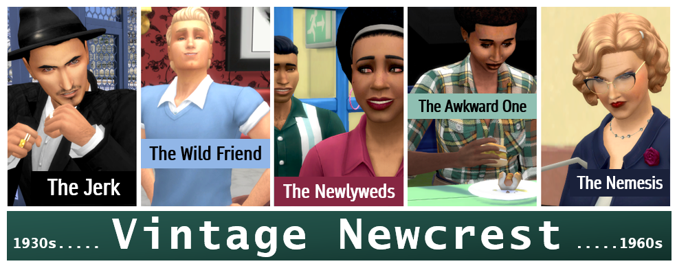
BannerMayNewcrestGradient.png
On EA forum Stories and Legacies board and on QueenOfMyshuno.tumblr.com

I Need Your Opinion--Which One Is Better? 39 votes

First Page is Way Better--you should do all your blog pages like that
25%
GalacticGalIrishSimmer21jeepjeepcatMsShaShaernesdofallenangel66ParmaViolet87Destin2016EricasFreePlayCupid 10 votes
First Page is Slightly Better--but it doesn't make that much of a difference
20%
icmnfrshStormkeepVibseChelleJoWulfsimmerEnkiSchmidtBreazonaRedShoe7 8 votes
They Look The Same--I didn't think one was better than the other
33%
vancanuckfan86GoldmoldartaydevToddly13fiercephoenix91MaggieMarleyWinifred_Willowsilver_songbirdEvaliyndreamprisonerAfterMidnightBusufuEvie0602 13 votes
Second Page is Better--the fancy stuff detracts from the blog
20%
Writin_RegkerryemmiebethDJQ1308Bagoas77KirbySkywalkerannaliese39Scribmusteni 8 votes

Comments

  • SimpkinSimpkin Posts: 7,425 Member
    nay for both lol cause they don't work with my adblocker. Not gonna remove it so anything that doesn't work with it on will not be looked at :)
    Seasons toggle button in build mode poll. Vote now please! :)
  • ripentogetherripentogether Posts: 87 Member
    Yeah, sorry, but neither appear for me
  • vancanuckfan86vancanuckfan86 Posts: 1,156 Member
    They Look The Same--I didn't think one was better than the other
    Both are well done - but they look about the same for me so I voted that way. Less visual can mean more people can access it as not all have great internet connections or computers.
  • CupidCupid Posts: 3,623 Member
    First Page is Way Better--you should do all your blog pages like that
    I prefer the look of the first one. Though I'm not sure about that "OMG." I'd stick to non verbal ones, the writing should be able to speak for itself :)
    HdLHa3j.png
    (◡‿◡✿)
  • QueenofMyshunoQueenofMyshuno Posts: 1,506 Member
    @Simpkin @ripentogether Okay, thanks for still posting. It’s good information for me to know that not everyone can access the wix site. I was not expecting that.
    BannerMayNewcrestGradient.png
    On EA forum Stories and Legacies board and on QueenOfMyshuno.tumblr.com
  • StormkeepStormkeep Posts: 7,632 Member
    edited November 2018
    First Page is Slightly Better--but it doesn't make that much of a difference
    @QueenofMyshuno My WoT (Web of Trust) addon pops up a warning when going to the site, so that is likely the reason some people might have access issues. Some browser/addon settings default to just not letting you visit rather than a popup warning like what i got. Specifically WoT says the site has a rating of known scam/phishing attempts. It is likely that the site host doesn't do a good job of policing the ads purchased for display at their site (and hence the adblocker issues as well).

    You may want to look into Tumblr, which takes a similar visual approach to what you are doing while not having a shoddy trust rating. If you want to take a look at what a basic tumblr page with just Sims pictures and text looks like, you can check my blog. You'll see it is visually very similar to what you are trying to do.

    Okay, as far as appearances goes, I voted for the 1st rather than the 2nd. They look very similar, the only main difference I noticed was borders on the images on the first one. I like images to have borders...for me that always looks better. I actually run all my screenshots through a batch process to add borders before I even upload them.
    This post will be edited by StormKeep at some point.
    2c2ab3785fad83173d9a155efa4afd1fc99b9595.jpg
    The Winters family Tree --- My Mods
  • QueenofMyshunoQueenofMyshuno Posts: 1,506 Member
    @Stormkeep Very cool blog. I like the borders and they way you laid the pictures out. The boys' names are funny--I hope they never have a falling out!

    I actually do have a tumblr, too, because I've been trying out options to replace my wordpress blog. I really like wix because it lets you do some pretty cool layouts on non-blog pages.

    Do you think people will still get the same warning if I pay to have ads removed? Like, does the adblocker know there are ads on the page coming up, or is it just the entire wix site that gets a bad rep, so everything wix is banned by some software?
    BannerMayNewcrestGradient.png
    On EA forum Stories and Legacies board and on QueenOfMyshuno.tumblr.com
  • simgirl1010simgirl1010 Posts: 35,862 Member
    I had a hard time choosing so I didn't. :p I get a different vibe from each layout but I like them both.
  • StormkeepStormkeep Posts: 7,632 Member
    edited November 2018
    First Page is Slightly Better--but it doesn't make that much of a difference
    @QueenofMyshuno, If the base host site is no different with or without ads (i.e. is still just wixsite.com) I suspect that it will still be warned or blocked for people who have good security features enabled. After checking out the WoT page for the site, I still proceeded to check out your blog because it really isn't a big deal if you don't click through on suspect ads, but not everyone is going to go through that sort of trouble.

    Personally, I'd hunt for a different host if you are doing it for other people en masse. If you're just doing it for yourself, or don't mind that a segment of the community at the very least will be blocked, and are happy with wix, go for it. I do mine just for a running record for myself, for example, so I wouldn't sweat that some people are blocked if it was me.

    And thanks for the kind words on my boys' names. It was sooo unplanned, but now it is what it is. So far they are bff's...but I only actively control Abel, so that could change at the whim of game AI at some point. Keeps things interesting having a household where you intentionally only active control specific sims (in my case, the founder originally and now the firstborn child).
    This post will be edited by StormKeep at some point.
    2c2ab3785fad83173d9a155efa4afd1fc99b9595.jpg
    The Winters family Tree --- My Mods
  • StormkeepStormkeep Posts: 7,632 Member
    edited November 2018
    First Page is Slightly Better--but it doesn't make that much of a difference
    Quick update, if you just want to check out what the safety rating from web of trust says, the WoT page for wix is here. It is really lacking in any detail with limited user reviews regarding reason for the safety warning, which is why I was willing to click through.

    From what information is there, it is clear that wixsite.com itself is safe, they just have some shady users. But, because it is flagged as unsafe, some blocking apps/addons will just block it, period.
    This post will be edited by StormKeep at some point.
    2c2ab3785fad83173d9a155efa4afd1fc99b9595.jpg
    The Winters family Tree --- My Mods
  • MsShaShaMsShaSha Posts: 52 Member
    First Page is Way Better--you should do all your blog pages like that
    I enjoyed the little visual touches in the first layout, they're fun and add a bit of interest. You could also use them to add/convey "mood" in the shades you use, that could be fun. Although I agree with @Cupid, and would probably stay clear of the text images.

    Your Sim is so pretty btw!

    uwxwhgf
    I build things some times. Origin ID: MsShaSha
  • DeKayDeKay Posts: 81,596 Member
    edited November 2018
    I probably should look at those on my comp. On mobile, they look almost the same where the first page can scroll thru fully but the second page seems to be confined within a small invisible square and you have to scroll thru within the square, if that makes sense.
    My Top Song of the Day: Innocence by Avril Lavigne
    832XG3D.gif
  • QueenofMyshunoQueenofMyshuno Posts: 1,506 Member
    Thank you everyone for your responses. I am really surprised by the results! I think I will stick with the colored borders and ditch the clipart, like some of you suggested. Finding the right clipart was the most time consuming part, so that makes it easier anyway.

    @simgirl1010 Okay, thanks for weighing in. That makes me happy that you like them both.

    @Stormkeep Thank you so much for all the detailed info on how the safety ratings work. Since the blog is mostly just for me (I mean, I don't even really try to have a plot or anything, LOL), I'm okay with wix, and if I decide I want to try to make it popular, then I think I can always just buy a domain and have my wix site forward to there but without the ads and without it being a wix address.

    @shasha46327 Thank you for your compliment on my sim. :smile: I think I went through about a hundred sims (literally) before I found the one I wanted, so a lot of time went into finding her and editing her to what I wanted.

    @DeKay That is so weird about the mobile. Thanks for letting me know. I tried it on my iphone, and it worked for me, so I'm hoping it was just maybe a temporary glitch or something.

    This was so helpful, so thanks again for participating, everyone.
    BannerMayNewcrestGradient.png
    On EA forum Stories and Legacies board and on QueenOfMyshuno.tumblr.com
  • mustenimusteni Posts: 5,405 Member
    Second Page is Better--the fancy stuff detracts from the blog
    I feel a little bit old school, but I liked the second one better. If I was reading the story, I wouldn't need the extra stuff to be there. I didn't hate the first one or anything, both seemed cool. Would go with the one you enjoyed making more :)
  • QueenofMyshunoQueenofMyshuno Posts: 1,506 Member
    Thank you for taking a look @luimistelija - I think a lot of people found some of the extra stuff distracting, not just you, so I don't think you are old school. :smile:
    BannerMayNewcrestGradient.png
    On EA forum Stories and Legacies board and on QueenOfMyshuno.tumblr.com
  • GalacticGalGalacticGal Posts: 28,552 Member
    First Page is Way Better--you should do all your blog pages like that
    I went back and forth to look a second time at both. In the end I feel the color enhancement in the frame of the screenshot was a really nice touch. Best of luck on your blog.
    You can download (free) all three volumes of my Night Whispers Star Trek Fanfiction here: http://galacticgal.deviantart.com/gallery/ You'll need to have a pdf reader. New websites: http://www.trekkiefanfiction.com/st-tos.php
    http://www.getfreeebooks.com/star-trek-original-series-fan-fiction-trilogy/
  • dreamprisonerdreamprisoner Posts: 1,221 Member
    They Look The Same--I didn't think one was better than the other
    Makes no difference to me, but it's your personal blog so it should be the style you like best.
  • annaliese39annaliese39 Posts: 2,797 Member
    Second Page is Better--the fancy stuff detracts from the blog
    I agree with luimistelija. I personally prefer the second page without all the fancy stuff, although honestly it doesn't make too much difference and I think you should just do whatever you like best.
Sign In or Register to comment.
Return to top