Forum Announcement, Click Here to Read More From EA_Cade.
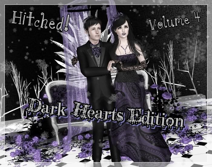
Hitched! Volume Four! Dark Hearts: Assignment Three Scores, assignment 4!!
 JKAmaryllis
Posts: 3,741 Member
JKAmaryllis
Posts: 3,741 Member
Winner of Assignment Three: Early!!

JKA
Creativity: 25
Quality: 25
Relation: 25
Pose: 25
Total: 100
Comments: I couldn't wait to comment on yours! Why you hatet his entry idk but I'm in love with it. The music shop idea was really realistic and I just really felt this one happening. I love the colors and you have really excellent lighting in this one! The camera angle is great and the ex.. perfect sap facial expression. I wanna see this play out on a show or something! BTW her outfit.. I would have never thought of that combination.. pretty awesome hehehe.
PK
Creativity 25/25
General Quality 25/25
Relation to assignment/ portrayal 25/25
Pose 25/25
Total 100/100
Comments: Yanno without the pose player in the way, you really get super creative with your poses, really blows me away, I truly do believe it’s making some of the best of the community a bit lazy so I’m glad you’re really thinking about when and where it works and when it doesn’t. This really shows a tonne of your couple’s personality and was a very creative place to first meet and first fall in love. The set is created really well, looks very much like a music shop. I do wish Constance looked a bit happier to be there, it does somewhat tie into the story because she’s a bit nervous and apprehensive about her ex, but she’s also got a sexy Alexander standing behind her so the girl should be at least cracking a little smile! Lol. I know you don’t edit but little things like changing the expression on your models is a nice little place to start....just practicing those little things that you can do to every picture.
Total: 200

Second Place: Simanims!
JKA
Creativity: 24
Quality: 24
Relation: 25
Pose: 25
Total: 98
Comments: You always do such a marvelous job with the sets! Elizabeth's pose and expression are what really have me in awe, as silly and simplistic as that might seem. It REALLY looks like a movie scene to me. I wouldn't mind a TINY bit more lighting on the set as it's simply beautiful and the placement of everything is just great. So much depth!
PK
Creativity 25/25
General Quality 24/25
Relation to assignment/ portrayal 25/25
Pose 25/25
Total 100/100
Comments: Such an amazing set. It blows my mind when I see pictures where there’s so much depth in the background that it’s obvious that the set is extremely elaborate, and this looks like you actually did some building as well as designing to get just the right scene. It’s great that all your entries still stay true to the overall theme of the competition and that original gothic style you had for Elizabeth and Tristen. The poses are fantastic and really get that emotion across that you wanted to portray from your story, even the extras in the background are amazing. I almost want a little bit more light on Elizabeth and Tristen themselves, but I think it’s still a perfect scoring picture without that little addition.
Total: 198
Kelren

JKA
Creativity: 24
Quality: 24
Relation: 25
Pose: 24
Total: 97
Comments: LOL I'm super curious to know what this play is about. What an adorable idea! I think its slightly odd she isn't looking at Ashe at all really. The director could have easily taken away from the pic, but she didn't so you did a great job with that. I know I'm being extremely picky here, but with the amount of detailing in the set, I think a solid wallpaper color would have helped the composition of the picture a bit.
PK
Creativity 25/25
General Quality 25/25
Relation to assignment/ portrayal 23/25
Pose 24/25
Total 97/100
Comments: Hands down the most creative place to fall in love and decide to express that emotion to one another. Love the angle of the shot, titled like someone is holding a cheap handycam, with the director off to one side, like she had just walked into the frame. I will say I was a bit confused with the background, I think with maybe a bit more detail on what the play was about might have cleared things up for me because the spider webs looked a bit out of place in what looked like a kitchen or a cafe. I get what you were going for with the outfit too, but it did still kinda look like clay and paint on her apron for me hehe, maybe a slight change of color or something for those stains.
Total: 194
Spychip

JKA
Creativity: 23
Quality: 24
Relation: 23
Pose: 23
Total: 93
Comments: It's a little nice and refreshing to see some color, however they just don't really look goth or punk here. Maybe Carrick a little bit. I like the composition and I do think going to the museum is something you'd definitely see a goth do moreso than some jock or something. I think their pose is maybe a tad boring, but in all honestly I think it's realistic and sweet. The setting is great, and I'm so glad there are extras. I think you should have moved the statue up *somewhat* closer to them so you can crop some of the pic and still see her head... it just takes up a lot of the pic, although I do think it adds some nice depth. Your lighting is great and the story is sweet.
PK
Creativity 25/25
General Quality 25/25
Relation to assignment/ portrayal 23/25
Pose 25/25
Total 98/100
Comments: I think this is the best picture we have had from you so far, you seem to be improving round to round it’s fantastic. I really love the creativity, really touching story wish something like that would happen to me lol. The poses are all kinds of adorable, Carrick looks like he’s really admiring that Statue and maybe imagining Terralyn in the toga instead of the deity hehe, and Terralyn looks like she’s just suddenly taken by Carrick and the beautiful thing he has just said and is reaching for his hand. The set is really well made, all the placement of the art is fantastic and I love that the shot is taken from over Aphrodite’s shoulder. Wasn’t a fan of all the extras in the background quite noticeably not posed and just randomly standing around....I think it’s only really particularly noticeable with the large collection of them you have around the door however. I’m looking forward to some edgier, darker entries too, something that really shows us how your couple fits into the ‘’Dark Hearts’’ theme, a lot of the entries you’ve done have been quite airy and normal.
Total: 191
[********[/b]

JKA
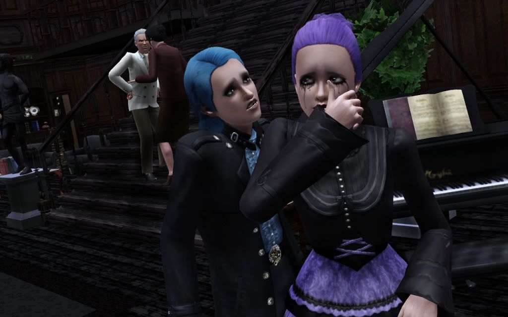
ashpie88
Creativity: 22
Quality: 24
Relation: 24
Pose: 23
Total: 93
Comments: YAY I love this one because it is close up to your couple, and you have some great little details thrown in. It's a sweet, tender moment for them and I'm almost slightly jealous, though I don't exactly understand why she was crying. His pose is great on it's own with the bottle of soda there, but I don't think its 100% appropriate for the picture. Maira looks stunning in her glothes! I do think they are almost awkwardly placed in the setting, like maybe they should be on a blanket.
PK
Creativity 23/25
General Quality 25/25
Relation to assignment/ portrayal 22/25
Pose 24/25
Total 94/100
Comments: Raif is starting to look and remind me more and more of an ex boyfriend of mine lol, its a little disturbing hehe. Love both their outfits so so very much, I don’t even know whose I love more. I like the poses, in particular Raif’s it has a real bad boy look about it, however the story and the poses don’t really match up. The story has all this emotion that we don’t at all see in the picture, and while the setting is nice it would have been even better to see some of that interaction and love between the two of them to really hit the higher marks
Total: 187
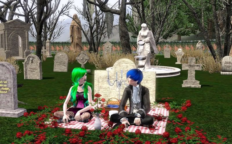
shizuko
JKA
Creativity: 23
Quality: 24
Relation: 23
Pose: 24
Total: 94
Comments: I think your set is REALLY gorgeous! It has lots of depth and detailing and it's just stunning overall. I like those roses, but be careful not to overuse them. I mentioned in the first round to most peeps and still kinda feel this way, but I think the cemetary although very fitting is teetering between classic and cliche. Tough call there. Your model's look great. I know you want to show off that beautiful setting, but I'd love to see the camera zoomed in much closer to your couple. If you press Q when you are in tab mode it will bring your camera down to where you can see them better and perhaps some of that gorgeous setting.
PK
Creativity 22/25
General Quality 25/25
Relation to assignment/ portrayal 25/25
Pose 20/25
Total 92/100
Comments: Yet another amazingly detailed set that you have obviously put a lot of time and effort into. The bright colors of Damien and Alice’s hair are wonderful it instantly grabs my eyes and drags them to their spot before allowing me to roam about the rest of the picture. The outfits are fantastic and the clutter items are placed perfectly. I do feel we are getting the same shot/angle from you all the time, always a level shot, always far away from your couple, so I really would like to see you change it up a bit, it’s getting a bit predictable. The poses were a bit boring too, I think they probably would have had more of an impact if we weren’t so far away from Alice and Damien, we can’t really get the impact of any eye contact at this distance.
Total: 186
Amieechu

JKA
Creativity: 23
Quality: 23
Relation: 23
Pose: 24
Total: 93
Comments: I'm totally jealous of their moment here! The poses are sweet and there is a lot of depth in the picture. I think the pic needs a little something to break up all that green.. Maybe if you had like a single wall behind them colored with one of the distress wood patterns, colored red to look like the old barn. Kinda love the plant up close though, shows the seclusion of their setting.
PK
Creativity 23/25
General Quality 24/25
Relation to assignment/ portrayal 21/25
Pose 24/25
Total 92/100
Comments: Bright colors galore! Loved the plant off to one side, the one really close to the camera, stuff like that really gives some realism to shots. Love how lush everything looks; I’m guessing that might be Aikea’s Castable grass you’re using? I might have to download it and start using it myself. I didn’t really get that, falling in love part of the picture which was what was the big issue for me, and you didn’t really help to get me to that point either with the description, just seemed like a regular old date in a really beautiful setting, just wish there was a bit of something that would show me how they ended up falling in love with each other, the moment they knew.
Total: 185
ladybug

JKA
Creativity: 23
Quality: 23
Relation: 24
Pose: 21
Total: 91
Comments: This is an angle I wouldn't have thought of! I REALLY love the "Love Conquers All" poster like it is a message to them. Their poses bug me a bit as Cato looks almost like he is laughing, and I know it would be hard to do and show both of their faces, but I think HelloKitty in this case wouldn't want Cato out of her sight. It has a bit of a random feel to it, which is kind of a plus and minus at the same time. I like the overall colors in the picture.
PK
Creativity 25/25
General Quality 22/25
Relation to assignment/ portrayal 23/25
Pose 21/25
Total 91/100
Comments: Creative idea! Love the dream angle really allows you to get a little crazy with the set and even the costumes. Really original story and I can see you spent a lot of time building a detailed set. The scene behind the glass looks great; it actually kinda reminds me of a museum and a caveman exhibit with all those objects. The rest of the set didn’t really mesh well....sure it’s a dream scene but stuff like the Moulin Rouge (at least that’s what it reminds me of lol) sign over the window just seemed like a bit of filler so the set was really detailed. Funky outfits once again staying true to Hellokitty and Cato’s personalities. Didn’t like Cato’s pose, he looks like he’s having fun more than being terrified of dying, likes he’s cheering and having a good time.
Total: 182
Simpixie

JKA
Creativity: 22
Quality: 22
Relation: 23
Pose: 22
Total: 89
Comments: The composition of this set is great, and The story is kind of sweet and realistic. The detail of the breakfast on the table is super cute. However I think the details and colors on your set just seem kind of random and nothing is working together for me. Also Zach's pose could be something more interesting and maybe they could be closer together. The lighting is a tad dark and I'm not sure if it's the lighting or the set but your models aren't really popping out at me. Keep up the good work though with your overall composition, I've always kind of favored pics int he corner of your room because the lines can draw your focus to your model and make them the focal point.
PK
Creativity 23/25
General Quality 23/25
Relation to assignment/ portrayal 21/25
Pose 20/25
Total 87/100
Comments: Zach and Ramona’s PJ’s are awsume hehe. I think they really give off some funky punkish vibes. I appreciate the details you added into the set, the story speaks of Ramona burning some waffles before resorting to impressing Zach with a bagel breakfast....and right there on the bench is some burnt waffles hehe. I kinda felt like the kitchen was a bit ordinary and mainstream looking for a couple of their calibre, I would kinda expect some wild funky wall colors, and maybe even some really dominant coloring like black appliances with red counter tops or something. The poses too were a bit flat, they do reflect your story but they lack a bit of animation especially Zach’s, the facial expression is great, but the body language is lacking. The shot could have done with a bit more light too, was a little bit dim.
Total: 176
Pixie

JKA
Creativity: 24
Quality: 22
Relation: 24
Pose: 20
Total: 90
Comments: This is a touching and heart breaking story, pix! You definitely thought this out and you've put a lot of detail into your pic! However I'm not super crazy about the vingetting around the pic, and Their poses aren't working for me. I know in general this is a storytelling comp, but for pictures' sake I'd love to see Amber awake and closer up so you can see her battered self. There's lots of great makeup. Trust me I've got experience in making sims look tortured. I'd also love to see Nate's pose/expression a little less panicky and more.. determined. Yanno like.. "I'll kill the ************ who did this to her." xD insert whatever word you'd like there
PK
Creativity 25/25
General Quality 21/25
Relation to assignment/ portrayal 20/25
Pose 20/25
Total 86/100
Comments: Aside from all the spelling mistakes (lol pixie spellcheck lady!) that was a really beautiful story, you thought really long and hard about something that would really bond a couple together instantly, something so profound that one could indentify that being a moment where they fell in love. The picture didn’t do the story justice though. Not a fan of the effect around it, and the set needed to be moved around a bit to fill in some of the empty spaces. Loved the gifting flowers animation it was really perfect for this picture, But I think it would have had more of an impact if we could see Nates face, maybe using an angle closer to him and Amber in the bed spinning that camera around to the left.
Total: 176
Maezinha
JKA
Creativity: 19
Quality: 19
Relation: 22
Pose: 19
Total: 79
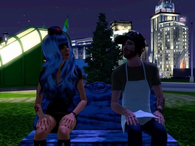
Comments: While your backdrop again is beautiful, and I do like it tying in to the last assignment showing that they live in a city, the shot overall needs a lot of work. PLEASE PLEASE check out that outdoor spotlight. Try that and try the buydebug lights, see which one works best for each picture. Their pose is very lackluster. One way I get interesting poses is to make them watch TV. You can always pause and delete it whenever they have something interesting/appropriate for your pic going on. Also watch your clothing.. typically this is a problem with girls and skirts, but Angel's apron is cutting through his hand. Your composition is pretty good but it would be better with better lighting on your couple, because my eye is drawn to brighter parts of your picture. Your story is tragic and sweet, I'd love for your picture to better show the creativity you have in your story.
PK
Creativity 21/25
General Quality 19/25
Relation to assignment/ portrayal 21/25
Pose 19/25
Total 80/100
Comments: Once again needs more light. I don’t generally start with negative feedback but I feel I need to really stress this, use some lights! It’s a major problem with all your shots. Another lovely Bridgeport backdrop, I’ve been experimenting myself trying to find some interesting new spots hehe. I love the little story, was adorable to see Angel in his work clothing I think he looks even cuter in that then in his normal clothing hehe. The poses were very boring, and Angel’s hand was cutting through his apron a bit because of his....though I think if there was some light and we could actually see their faces that eye contact between them might have made the poses look a lot better.
Total: 159
~Maezinha, I'm sorry, but you've been eliminated. Thank you for being a part of Hitched! Good luck to you in your future comps. We'll miss Cornilia and Angel

Steam: JKAmaryllis
0
Comments
SimsARL (Alexander and Constance) :shock:
Spychip (Carrick and Terralyn)
amieechu (Helvetica and Cato) :shock:
Shizuko87 (Damien and Alice)
simslover740 (Acai and Victoria)
Simanims (Elizabeth and Tristen)
kelren (Ashe and Scarlett)
pixie30 (Nate and Amber Damage)
ashpie88 (Raif and Moira)
ladybug65 (Cato and KelloKitty) :shock:
Maezinha (Angel and Cornilia Neverland)
Simpixie2255 (Zach and Ramona Clear) :shock:
Assignment Four:
The Wedding!
It's time to backtrack a bit and take a stroll through the wedding album! I want to see a shot from your couple's wedding! Did they give in to their parent's demands and have a traditional white wedding? Or did they do it their own way? It doesn't have to be like.. normal.. not sure how it could be with goth and punk couples, but I really do want detail in these pics! Not just a wedding by the back door with no details. (Trust me I've seen it :evil: )
Due: Sunday, July 3
JKA
[img]http://i22.photobucket.com/albums/b313/sweetferocious/Sims 3/Simself.png "width=200"[/img]
PK
Press ctrl, shift and C to pull up your cheat menu.
buydebug on: adds a menu in your buy mode and gives you tons of stuff that will be helpful especially in a sci-fi fantasy comp like this. There are also some invisible lights, very helpful for lighting your sims' faces!
moveobjects on: Just incredibly useful all around. I can't even begin to go over the uses for this.
hideheadlineeffects on: gets rid of those pesky thought bubbles and plumbobs.
Hold in alt while moveobjects is on so your object/sim won't snap to a grid!
Press tab when in live mode to help with picture taking.
Camera controls:
W - forward
S - back
A - Left
D - Right
E - Tilts up
Q - tilts down
Shift plus A - Rolls to the left
Shift plus D - Rolls to the right
Z- zoom in
X - Zoom out
Shift and S - reset
1. If there is a drop or no show there will not be an elimination.
2. I understand that there are some times when you can't continue for one reason or another, but I think it's EXTREMELY rude to just not show up. I know I can't enforce this, but please if you have decided not to continue, please let us know!
3. Please ask for extensions if needed. They will will be granted if a reasonable request.
4. Changes to models: This is something I'm extremely lenient with. I mainly want them recognizable as the same person. Sometimes your game gets borked, etc and you need to make a new model and that's fine.... or sometimes you decide to uninstall a skin and need to change their skin.. that's also fine. Just try to keep their facial features the same so we can recognize them. You can change hair color (that's kind of a common thing in goth/punk anyway) and style of course. If you have any questions about it just ask
5. Same sex couples are allowed.
6. Editing is allowed, but just realize that editing may help OR hurt you. Just depends on how it looks.
7. Because my job has a random unpredictable schedule, due dates will probably be a little over a week. This doesn't mean I want to wait forever for people to turn in their assignments though.
Nothing yet xD
Steam: JKAmaryllis
Steam: JKAmaryllis
Can't wait for the assignment.
Steam: JKAmaryllis
BTW love your new avi, Early
Steam: JKAmaryllis
BTW thank you so much for your wonderful scores and feedback for everyone
Steam: JKAmaryllis
My apologies for the spelling mistakes and tarded sounding sentences....I'm sure there are some, I won't be doing scores again when I'm tired lol
Steam: JKAmaryllis
I realize its taking me a bit to get back into the swing of things. I know I can do better.
Steam: JKAmaryllis
On to the next one! This will be fun.
After we exchanged rings we looked in each others eyes and laughed, we just stood and laughed.
It had come to this, a private wedding in an old victorian greenhouse. We did it, we got away from it all...it
was just us now, us against the world. The warm light filtered though the old glass, this was
beyond perfect, as they say, love conquers all.
click for full
YEY so excited for this assignemnt have an Idea
Steam: JKAmaryllis
Really looking forward to seeing everyone's wedding pictures
After I posted it I thought it could of used a blanket too. >.<